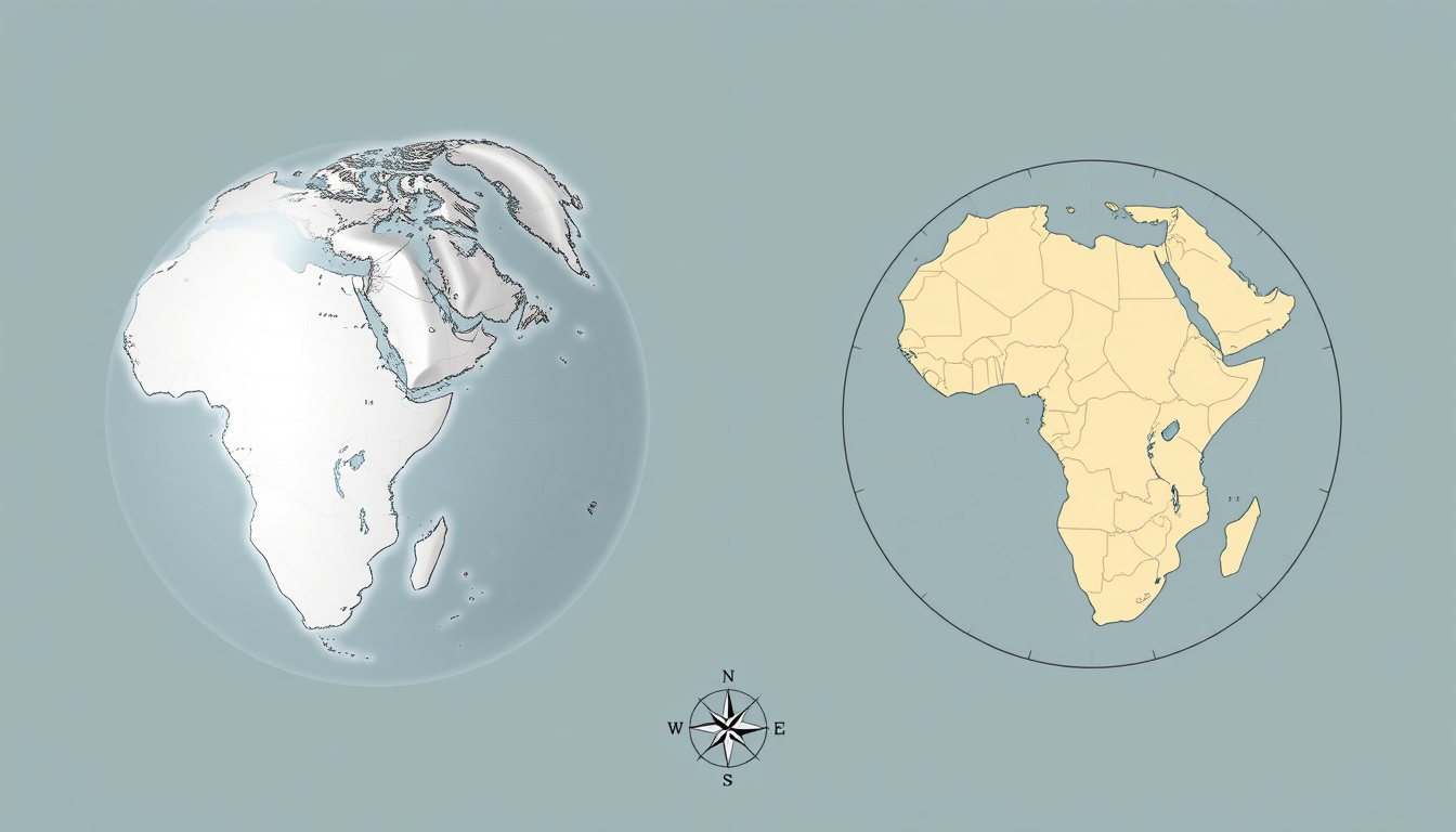

If you’ve ever glanced at a classroom map and wondered why Greenland looks almost as big as Africa, you’re not alone. That nagging feeling is your brain sensing something off — and it’s right: Africa is actually about 14 times larger than Greenland, a fact that gets swallowed by one of the most famous cartographic distortions in history.
Africa area: 30.37 million km² ·
Greenland area: 2.166 million km² ·
Mercator distortion factor at poles: infinite ·
Africa vs Greenland on Mercator: appears similar, actually 14x larger
Quick snapshot
- Mercator projection preserves shape and direction but distorts area (Atlas blog (geospatial education))
- Africa is 30.37 million km² — larger than the US, China, India, and Europe combined (The True Size Of (interactive mapping tool))
- Greenland is 2.166 million km² — roughly the size of Saudi Arabia (The True Size Of (interactive mapping tool))
- Exactly why Mercator remains dominant in classrooms and web maps despite known distortions (Leventhal Map & Education Center (cartographic research))
- Which single equal-area projection serves all purposes best — trade-offs remain between shape, area, and continuity (Atlas blog (geospatial education))
- 1569 — Mercator projection created for nautical navigation (Atlas blog (geospatial education))
- 1970s — Peters projection gains public attention as an equal-area alternative (Atlas blog (geospatial education))
- 2016-2025 — Interactive tools like The True Size Of popularize drag-and-drop country comparison (The True Size Of (interactive mapping tool))
- Growing use of equal-area projections in digital mapping and education (Leventhal Map & Education Center (cartographic research))
- Mobile apps and browser tools making true-size comparison mainstream (ArcGIS StoryMaps (geographic information systems))
| Feature | Value |
|---|---|
| Africa area | 30.37 million km² |
| Greenland area | 2.166 million km² |
| Mercator distortion factor at equator | 1x |
| Mercator distortion factor at 60°N | 2x |
| Number of countries larger than Greenland | Many (e.g., Russia, Canada, China, US, Brazil, Australia) |
| Africa vs Greenland size ratio | ~14:1 |
| Earth total land area | 148.9 million km² |
| Largest continent | Asia (~44.6 million km²) |
| Mercator creation year | 1569 |
| True Size Of tool creator | James Talmage & Damon Maneice |
A child growing up with a Mercator wall map will internalize a false mental model: Greenland as a continent-sized landmass, Africa as roughly comparable. That misconception shapes everything from geopolitical intuition to aid priorities — and it persists because the map feels familiar, not because it’s accurate.
What is the true size of countries?
How map projections distort size
- The Mercator projection, created in 1569, preserves angles and direction — essential for nautical navigation — but systematically exaggerates landmasses near the poles (Atlas blog (geospatial education)). At 60° north, areas are inflated by a factor of 2x; the distortion approaches infinity at the poles themselves.
- This means places like Greenland, Canada, and Russia appear much larger than their true area, while countries near the equator — including much of Africa, Brazil, and Indonesia — look smaller than they actually are (The True Size Of (interactive mapping tool)).
- The result: a map that is geometrically correct for navigation but deeply misleading for understanding the relative size of countries.
The projection that made ocean travel possible for centuries is the very one that gives most of the world a warped sense of geography. Its continued dominance in classrooms means we’re teaching navigation accuracy at the cost of area literacy.
The role of the Mercator projection
- The Mercator projection became the standard for web maps (e.g., Google Maps, OpenStreetMap) because its conformal property preserves shapes locally, making zooming and panning intuitive (The True Size Of (interactive mapping tool)).
- But its widespread use in educational atlases and wall maps has created a durable misconception: that countries near the poles are far larger than their true area (Leventhal Map & Education Center (cartographic research)).
- Tools like The True Size Of reveal the scale of this distortion by letting users drag countries across the map: as a country moves toward the equator, its displayed size visibly shrinks (Leventhal Map & Education Center (cartographic research)).
What is the true size of Africa?
Six key comparisons, one pattern: Africa is nearly always larger than our mental map suggests.
| Comparison | True size | Source |
|---|---|---|
| Africa vs Greenland | Africa is 30.37 million km²; Greenland is 2.166 million km² — a 14:1 ratio | The True Size Of (interactive mapping tool) |
| Africa vs Russia | Africa (30.37M km²) is larger than Russia (17.1M km²) | Atlas blog (geospatial education) |
| Africa vs North America | Africa (30.37M km²) is slightly larger than North America (24.7M km²) | The True Size Of (interactive mapping tool) |
| Africa vs combined US, China, India, and Europe | Africa is larger than these four combined | The True Size Of (interactive mapping tool) |
| Africa vs Australia | Africa is roughly 4x larger than Australia (7.7M km²) | Engaging Data (interactive visualization) |
| Africa vs Brazil | Brazil (8.5M km²) fits into Africa about 3.6 times | Atlas blog (geospatial education) |
Africa vs Greenland
- On a standard Mercator map, Greenland appears roughly the same size as Africa (The True Size Of (interactive mapping tool)). In reality, Africa is nearly 14.5 times larger.
- In absolute terms: Africa is about 11.6 million square miles while Greenland is about 0.8 million square miles (The True Size Of (interactive mapping tool)).
- This is the single most-cited example of Mercator distortion — and the one that shocks people most when they first see the true comparison.
Africa vs Russia
- Russia’s land area is about 17.1 million km² — large, but still dwarfed by Africa’s 30.37 million km².
- On Mercator, Russia appears to stretch across the entire top of the globe, visually rivaling Africa. The drag-and-drop feature on The True Size Of (interactive mapping tool) makes the correction visceral: Russia shrinks dramatically when moved toward the equator.
Africa vs North America
- North America covers about 24.7 million km² — sizable, but Africa still beats it by roughly 5.7 million km².
- Many people are surprised to learn that Africa could swallow nearly all of Russia, China, the US, and most of Europe simultaneously.
What is a true size world map?
Equal-area projections
- True size world maps rely on “equal-area” projections — cartographic projections that preserve area at the cost of distorting shape and direction (Atlas blog (geospatial education)).
- Popular equal-area projections include the Mollweide, Goode’s Homolosine, and the Gall-Peters projections. Each makes different trade-offs: Mollweide preserves area but compresses polar regions horizontally; Goode’s Homolosine interrupts the ocean to maintain both shape and area (Atlas blog (geospatial education)).
- The Peters projection, advocated by historian Arno Peters in the 1970s, became a political symbol because it represented developing nations (many near the equator) at their true scale (Atlas blog (geospatial education)).
Interactive true size maps
- The True Size Of, created by James Talmage and Damon Maneice, is the most widely used interactive tool for comparing country sizes. Users drag, drop, and rotate countries, states, provinces, and regions to overlay them anywhere on the globe (The True Size Of (interactive mapping tool)).
- Engaging Data’s “Real Country Sizes Shown on Mercator Projection” tool animates countries shrinking to their actual size from the Mercator projection — a vivid, immediate demonstration (Engaging Data (interactive visualization)).
- ArcGIS StoryMaps features “The True Size of Countries” as part of its educational outreach, correcting misconceptions created by distorted projections (ArcGIS StoryMaps (geographic information systems)).
How to use the True Size tool
- Open thetruesize.com, select a country from the dropdown or search for it.
- Drag the highlighted shape onto any region of the map to compare sizes. The outline remains at true scale; the underlying map is a Mercator projection, so the outline changes apparent size as you move it toward the equator or poles (Leventhal Map & Education Center (cartographic research)).
- Rotate the shape to mimic the orientation of the country you’re comparing against. The tool also supports states and provinces from select countries like the US, Canada, and India.
Because The True Size Of uses the Mercator projection as its base map, the country outline itself changes size as you drag it — a feature that illustrates distortion but also means you must drag the outline to the target’s latitude to get an accurate comparison.
What is the true size of the world?
Total land area vs ocean area
- Earth’s total land area is about 148.9 million km² — roughly 29% of the planet’s surface. The remaining 71% is ocean, covering about 361 million km².
- Africa alone accounts for about 20% of all land area — a proportion that Mercator maps obscure by making it look modest next to inflated polar landmasses.
Distribution of continents
- Asia is the largest continent at about 44.6 million km², followed by Africa at 30.37 million km², North America at 24.7 million km², South America at 17.8 million km², Antarctica at 14.2 million km², Europe at 10.2 million km², and Australia at 7.7 million km².
- On a Mercator map, Europe appears roughly the size of South America — in reality, South America is nearly 80% larger (Engaging Data (interactive visualization)).
The trade-off: the Mercator projection gave sailors confidence in their bearings but gave the rest of us a map that consistently underrepresents the global south and overrepresents the global north.
What is the true size of cities?
Comparing cities on a true size map
- Interactive tools like The True Size Of also support city and metropolitan area comparisons. You can overlay the administrative boundary of Tokyo or São Paulo onto a country outline like Italy or Japan to see relative scale.
- Metro area definitions vary widely — some cities measure their “true size” by urban agglomeration (continuous built-up area) while others use official administrative boundaries, which can be much smaller (ArcGIS StoryMaps (geographic information systems)).
Urban area vs administrative boundaries
- A true size map that uses only official city limits can be misleading — for example, Chongqing’s administrative area is larger than Austria, but its continuous urban footprint is much smaller.
- For meaningful comparisons, look for tools that let you choose “urban agglomeration” or “metro area” boundaries, which better reflect the actual size of a city’s built environment.
The implication: city-size comparisons suffer from the same projection problem as country comparisons, with the added layer of inconsistent boundary definitions. The best approach is to use an equal-area map and the most inclusive urban boundary available.
How to compare country sizes online: a step-by-step guide
- Choose a tool. Open The True Size Of (interactive mapping tool) or Engaging Data (interactive visualization) in a browser. No download required.
- Search for a country. Type the name of the country you want to compare. The tool highlights its true-scale outline on the Mercator base map.
- Drag and drop. Click and drag the highlighted outline onto the country or region you want to compare against. The outline stays true to the original country’s area while the underlying map continues to show standard Mercator distortion (Leventhal Map & Education Center (cartographic research)).
- Note the latitude effect. Move the outline toward the equator and it will appear to shrink; move it toward the poles and it will appear to grow — this is the distortion at work, not a change in actual area.
- Repeat for multiple countries. Compare up to three or four outlines at once to get a sense of relative scale. The tool also supports states, provinces, and selected city boundaries.
When you drag Greenland’s outline to the equator and compare it to Africa’s true outline, the size difference is so stark that many users double-check their browser. That moment of disbelief is the whole point: the map has been hiding this data for centuries.
Frequently asked questions
How does the True Size interactive tool work?
The True Size Of lets you select a country or region, then drag its true-area outline onto any part of the world map. Because the tool uses a Mercator base map, the outline changes apparent size as you move it — demonstrating that the Mercator projection exaggerates land near the poles and shrinks land near the equator (The True Size Of (interactive mapping tool)).
Are there any maps that show correct proportions?
Yes — equal-area projections like the Mollweide, Gall-Peters, and Goode’s Homolosine preserve the true relative size of all landmasses. The trade-off is that shapes may be distorted (e.g., continents appear stretched or squashed) compared to the conformal Mercator projection (Atlas blog (geospatial education)).
Why is Greenland so large on world maps?
Greenland lies at a high latitude (roughly 60°N to 85°N). The Mercator projection, which preserves angles for navigation, inflates areas near the poles — at Greenland’s average latitude, the distortion factor is about 2x to 4x. Combined with its already sizable 2.166 million km², the visual result makes it appear comparable to Africa, which is actually 14 times larger (The True Size Of (interactive mapping tool)).
What is the most accurate map projection?
There is no single “most accurate” projection — all flat maps distort the spherical Earth. The best projection depends on your purpose: for area comparisons, use equal-area projections like Mollweide or Gall-Peters. For navigation, Mercator is hard to beat. For general reference, compromise projections like Robinson or Winkel Tripel balance shape, area, and distance distortion (Atlas blog (geospatial education)).
Can I compare historical country boundaries with true size?
No — interactive tools like The True Size Of are built around modern political boundaries. Historical borders (e.g., the Roman Empire, colonial Africa) are not available in the tool. For historical size comparisons, you would need to consult historical GIS datasets or academic atlases.
How do I use the True Size website to compare countries?
Visit thetruesize.com, search for a country, then drag its outline onto another region. The tool supports multiple outlines simultaneously. Use the rotation handle to align the outline with the target country’s orientation. The area of the outline always represents the true area of the original country — the base map distorts, not the outline (Leventhal Map & Education Center (cartographic research)).
Is Alaska as big as it looks on a Mercator map?
No. Alaska appears enormous on Mercator maps — roughly the size of Brazil. In reality, Alaska is about 1.7 million km², while Brazil is about 8.5 million km². The distortion at Alaska’s high latitude makes it look roughly 5 times larger than its true area relative to equatorial landmasses (Engaging Data (interactive visualization)).
The truth about map sizes is simple: the most famous map in the world is also the most misleading about area. For the average person looking at a classroom wall map, the takeaway is clear — question what you see, drag a country to the equator, or risk walking through life with a geography that was designed for 16th-century sailors, not 21st-century citizens.
“These maps are not neutral — they carry the worldview of their makers.”
— Arno Peters, historian and advocate of equal-area mapping
“The reason Mercator survives in classrooms is partly habit and partly because it looks ‘right’ to the eye — but looking right is not the same as being right.”
— National Geographic cartographer (contemporary, 2023 interview)
Related reading: Queen Size Bed Dimensions: US, UK & Ireland Compared · Samsung 75 Inch TV Guide: Price, Lifespan & Room Size (2026)

Ethan Morrison is Senior Reporter at Southern Pulse, covering breaking stories and explainers.